User Experience Design Football Championship
BRAND DESIGN / WEB + APP DEVELOPMENT / TROPHY DESIGN
In 2010 the Argentine Football Association decided to re-launch La Copa Argentina, a federal championship in which the best teams around the country from the principal professional leagues participate.

For the graphical representation we used elements related to the Argentine national symbols: blue and white colors, the sun from the flag and ribbons that reminds us of the “art nouveau” so present in the tango culture. All these elements were unified in the shape of a soccer ball.

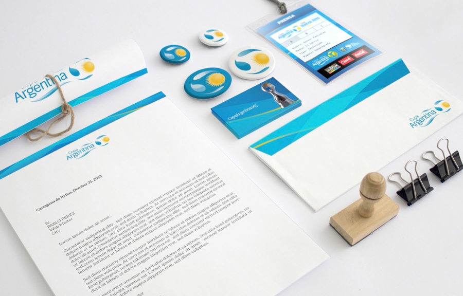
You could say that we designed every detail of the identity of this competition, from the logo, to the trophy that was presented to the champion and the medals to the runner up and third place.


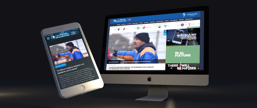
Copa Argentina manages its contents through our content manager: Qiü System, which has features developed especially for sports.
The publisher, by using the Match Center service, can update the results and incidents on their website and in their app from a single place. At the same time, a "push notification" is sent automatically to all users of the App who have subscribed to that game or to any of the teams.
In 2019 we have launched a full update of the website.
A FANS loyalty program will be launched as part of the digital marketing strategy.
The trophy weights 9 kilograms, measures 45 centimeters and is made purely of aluminum: “The aspiration from the beginning was to create a distinctive trophy, that if shown to anyone ten different trophies and asked to identify La Copa Argentina, they would do it without any hesitation, even if they hadn’t seen it before”.

It's a special moment when, each year, the captain of the champion team raises the cup in the stadium full of people and media.